On the Beach
CASE STUDY



Company
On the Beach Group is a UK-based online travel agency specialising in short and medium haul package holidays to Europe. With a proprietary technology platform combined with a market-leading proposition, they provide customers with value, choice, flexibility and financial protection.
Title(s):
UX Designer (Apr 2016 - May 2017)
Focus areas:
Responsive Design, Bookings Portal Design, Design Processes
I joined On the Beach at an exciting time as the business was preparing to transition from a separate mobile site to a fully responsive platform.
It was refreshing to work in a squad model, with dedicated teams focused on different areas of the website. Early on, I identified opportunities to improve the design process and once I'd settled in I made it a priority to drive more efficient ways of working across these teams.
Responsive Design
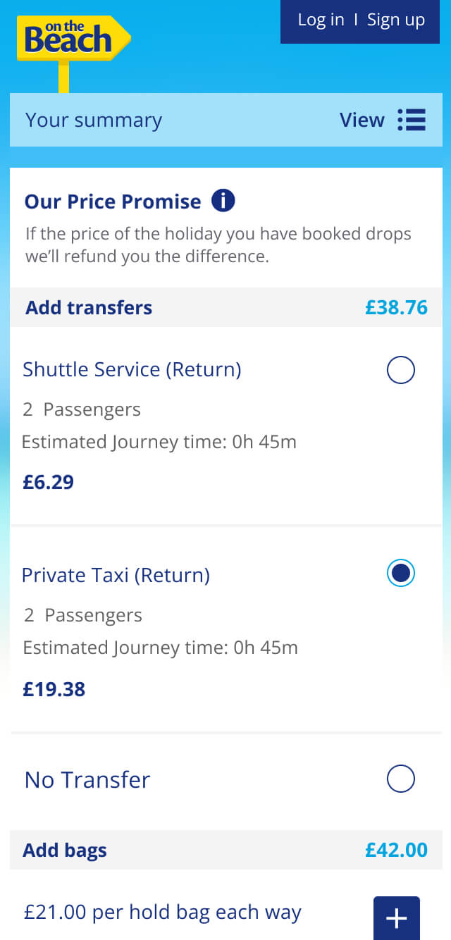
Alongside modernising the mobile UI, a key goal of the responsive redesign was to give users a consistent touchpoint throughout the booking journey, showing their current holiday selection (effectively a persistent basket) from flight selection through to hotel booking. As the journey was long and detailed, this helped users keep track of their booking.
At the time, the On the Beach logo sat on a signpost which influenced the design. It needed to remain attached to an element rather than appear to float, so we worked within those constraints to find a solution.

Bookings Portal Design
At the time, we were receiving a high volume of calls for simple tasks such as making payments. Customer Care also reported that customers were struggling to pay online, so the goal was to improve the post-booking payment experience, reduce call volumes and encourage self-service.
The main improvements included a clearer, more detailed payment summary to give users better visibility of their payments, alongside an upgraded 'Make a payment' experience.


Flight Graph
This was a fun project that went through several iterations. The aim was to create a visual way to improve flight option visibility and help users make quicker, more informed decisions. Rather than showing a full month, the graph highlighted the cheapest dates across a 20-day period that centred on the user's selected travel date, helping them spot better-value options.
At the time, Momondo had implemented a similar feature well, so we reviewed their approach, taking inspiration from what worked while identifying opportunities to improve the design and functionality.
The feature was A/B tested during a sprint. It saw strong user interaction and a slight reduction in time spent on page. While the short test window meant we couldn't directly attribute time on page to the graph, the overall results were positive.

Visual Search
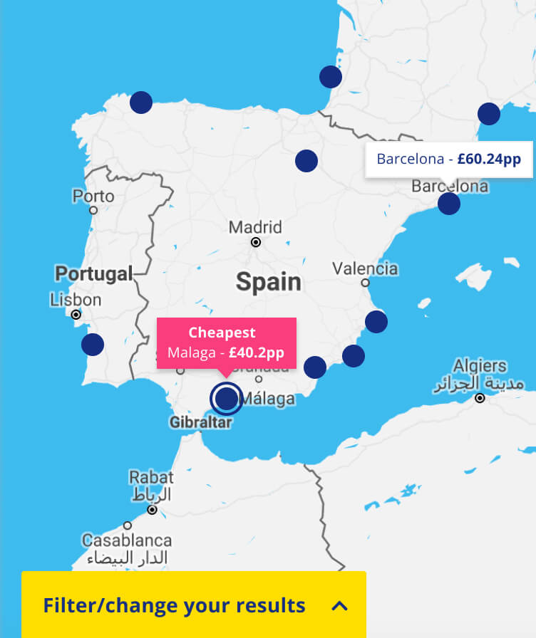
During Innovation Week at On the Beach, I was part of a team that proposed a visual search experience. While we already had a basic map view in parts of the booking journey, the aim was to create a consistent, more user-friendly map that supported the same actions as the traditional search experience.
Rather than replacing the existing search, visual search was introduced as an alternative, giving users the choice of whichever method suited them best while improving destination discoverability.


Design Processes
Teams worked in sprints but discovery and design ran alongside development. This often left developers waiting for work, while designers had to compress research and prototyping into the first half of the sprint.
Working with a Senior Business Analyst, I helped redesign the sprint process by staggering design and development cycles, giving design a two-week head start to complete discovery and prototyping before development began.
We also encouraged a shift towards iterative delivery, moving away from the expectation that everything had to be completed in a single sprint and promoting testing with refinement where projects required it.
Case studies
Diverse experience across industries including baby care, travel and finance.